Get Lost link: file:///Volumes/ELAINE%20ZIP/website/GetLost/Getlosthomemap.html
Portfolio link: students.smcm.edu/ebbucknam
Tuesday, April 23, 2013
Saturday, April 13, 2013
Web Designer Post: Colorz
Colorz is a French web design company, founded in 2006 by three up and coming designers. The trio began by working with small French blogs and small businesses, some of which went on to do quite well. As these companies and their websites gained more popularity, so did their web designer, Colorz. The Colorz team, now consisting of more than twenty designers, makes websites for well respected and well known clients including Universal Studios, popular blogs such as Garance Dore and The Sartorialist, as well as fashion designers and retailers. Their most recently completed project was for Colette, a large French retailer planning to expand internationally. They commissioned Colorz to revamp their site in order to appeal to a younger clientele.
I think Colorz has been successful because of their clean yet detailed design aesthetic. Their work feels very fresh and updated, and while a little quirky, it's relatable and easy to use. I appreciate that in creating sites that are visually appealing, Colorz does not sacrifice ease of use. They are also good at tailoring their aesthetic and skills to fit the needs of different clients. While all Colorz's designs have a similar feel, they also do an excellent job of presenting the mission and needs of their clientele.
I also find it interesting that a company like Colorz, that was started so recently, has done so well and is expanding so quickly. Colorz's success, and the success of many other web designers like them, really speaks to this idea of the rapidly expanding digital age. By riding the wave of increased internet use, especially through personal blogs and other new forms of digital communication in the mid 2000's, Colorz has really established a niche in the web design market. It should be interesting to see over the next few years if Colorz is able to continue their expansion, and if more and more of their web design work will be for internationally companies and groups based outside of France.
 |
| Colorz's web design for Colette. |
I think Colorz has been successful because of their clean yet detailed design aesthetic. Their work feels very fresh and updated, and while a little quirky, it's relatable and easy to use. I appreciate that in creating sites that are visually appealing, Colorz does not sacrifice ease of use. They are also good at tailoring their aesthetic and skills to fit the needs of different clients. While all Colorz's designs have a similar feel, they also do an excellent job of presenting the mission and needs of their clientele.
 |
| Colorz's web design for blog Garance Dore. |
I also find it interesting that a company like Colorz, that was started so recently, has done so well and is expanding so quickly. Colorz's success, and the success of many other web designers like them, really speaks to this idea of the rapidly expanding digital age. By riding the wave of increased internet use, especially through personal blogs and other new forms of digital communication in the mid 2000's, Colorz has really established a niche in the web design market. It should be interesting to see over the next few years if Colorz is able to continue their expansion, and if more and more of their web design work will be for internationally companies and groups based outside of France.
Sunday, April 7, 2013


Thursday, March 28, 2013
Vito Acconci Reading Reaction
I find Acconci's concepts interesting, but I'm not sure if I totally agree with everything he proposes about public spaces. His ideas strike me as a bit cynical, perhaps too exaggerated. While our views of public spaces have certainly changed, I don't think they've changed as drastically as Acconci proposes, nor do I think the change is good or bad. It simply is.
Acconci's discussion of what our public spaces say about ourselves and our specific interactions with one another (Subsection 10) was especially interesting to me. This idea of "payment" is rather vague and again, cynical, but I relate to it on some level. The third-to-last sentence, on the expected roles we play in different public spaces, particularly made sense to me. We go to some public spaces specifically to make human contact, while in others, isolation is the norm.
Acconci's discussion of what our public spaces say about ourselves and our specific interactions with one another (Subsection 10) was especially interesting to me. This idea of "payment" is rather vague and again, cynical, but I relate to it on some level. The third-to-last sentence, on the expected roles we play in different public spaces, particularly made sense to me. We go to some public spaces specifically to make human contact, while in others, isolation is the norm.
Artist Talk Summary: Kate McCammon
I really enjoyed McCammon's talk; she had a lot of good advice and experience to share, and I related strongly to her methods and subject matter as a painter.
McCammon began by discussing a series of large scale portraits she created during her sophomore year at MICA, which led to her spending two months in the studio of respected Norwegian painter Odd Nerdrum. She discussed how this experience changed her world outlook, as well as her painting style, and encouraged her to pursue more painting opportunities abroad.
McCammon has primarily worked abroad since then in Italy, initially moving from figurative to landscape work, and eventually combining these two subject matters. She is currently working as an art instructor in West Virginia, and will go on two more international artist residencies later this year, one in Venice and another in Ireland.
What I most enjoyed about McCammon's talk was her discussion of her initial struggles as a painter at MICA, particularly with paint application, as well as her shifts in compositional styles and subject matter. McCammon's art explores themes of personal narrative, the imperfect nature of memories, and the capturing of the essence of a place, person, etc, through the depiction of small detail (in her landscape paintings, McCammon was fascinated by drawing hanging laundry as depictions of Venice, Rome, etc). I also loved her explanation of how she was influence predominately by the old masters in her work, and how the experience of stumbling upon one or two small paintings or drawings by such masters had at times greatly influenced her perception of her field and subject matter.
Tuesday, March 26, 2013

Saturday, March 2, 2013

Vector Artist Post
Chris Leavens
 |
| Lights Out |
Chris Leavens is a Los Angeles based vector illustrator specializing in surrealist images. His works often comprise bizarre monsters and imagined characters interacting in mythical landscapes. His pieces incorporate the humorous and bizarre with a playful tone. Leavens' works have appeared in galleries, computer games, TV shows, and films. He currently works as an animator and designer for Disney Publishing.
 |
| Dudleya |
Interestingly, Leavens' educational background is in cinematography. He received a BA in film and video from Penn State University, and spent several years working in the film industry as a film editor and motion graphics designer. After several years in the film industry, Leavens decided to "take a break" from video work to explore illustration. Since then, he has worked primarily as an illustrator, graphic designer and web designer, with much commercial success.
 |
| Festivus |
I love the quirky nature of Leavens' pieces; it's hard to examine his work without smiling. While the unique figures and settings in these images play a large role in the development of this mood, I think Leavens' use of color also plays a larger role in creating this unique atmosphere. Leavens' use of color creates a nice balance; his palettes are saturated and bright without being overpowering, working to highlight the strengths of Leavens' drawings. The pieces have a Dr. Seuss-esque feel that is quite lovely. Leavens' mastery of illustrator is also obvious in his works;
Tuesday, February 19, 2013


Monday, February 18, 2013


Tuesday, February 12, 2013
Artist Post:Tony Robbin

Tony Robbin is a local American artist (a native of Washington D.C) who combines influences as wide-ranging as modern physics and the cubist movement. He has participated in over 100 group art shows, and has had over 25 solo exhibitions since debuting his artwork in 1974. Through his two dimensional digital drawings, Robbin attempts to create visual representations of four dimensional space. Robbin has also attempted to depict four-dimensional space through three dimensional sculpture, although he is best known his digital drawings. Robbin was actual a forerunner for the computer visualization of four-dimensional geometry, and holds the patent for "Quasicrystal" software, which he employs in many of his two and three dimensional works. He also lectures extensively on a variety of topics, including architecture, engineering, computer science, physics, mathematics, and art. Robbin has also published several books on his interdisciplinary approaches to mathematics, art, and digital technologies.
Robbin is considered a member of the only art movement of the post-modern era, known as pattern and decoration, or P&D. The movement was a contemporary reaction against Minimalism, and followed a "more is more" philosophy, focusing on highly saturated colors, complex patterns, and graphic images. While many other members of this movement employ more traditional media, such as painting and printmaking, Robbin's work integrates nicely with that of his contemporaries. Many other members of the P&D movement drew inspiration extensively from folk art, in particular, fabrics, in their artwork. Robbin's works reference and draw influences from similar backgrounds, including geometric Persian motifs, Japanese silk kimonos, and other textiles.
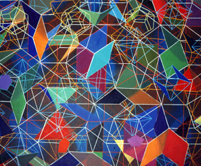
I find Robbin's works aesthetically pleasing and visually interesting; the line patterns and vast array of colors keep the viewer's eye moving, and the ornate compositions of geometric shapes are impressive. Robbin's pieces are also excellent examples of seamless integration of digital technology into art; the drawings have a painterly, hand drawn feel to them, which keeps the jagged angles and lines from feeling artificial and forced. However, though the concepts behind Robbin's works are fascinating, viewed as a whole, his body of art strikes me as somewhat repetitive. While Robbin has dabbled in sculpture, his three dimensional work is extremely similar in subject matter and composition to his drawings, and does not offer any more intriguing innovations. Considering his career as an artist spans over 40 years, his subject matter and methods of depiction remain quite static. I would be really interested to see any of Robbin's works in other medias, or even pieces with varying subject matter and compositions. Despite this, I think Robbin's works are for the most part very successful, and very engaging for the viewer. His balancing of color and detailed geometric figures is especially impressive.
Sunday, February 3, 2013
Copyright Symposium Summary
I found much of the information discussed by Dr. Kenneth Crews during the morning session of the symposium to be quite informative and applicable to daily life, more so than I had expected. I was also surprised by the complexity of copyright issues; how much protection should be granted an original work, what constitutes fair use, the transfer of copyright to museums, buyers, etc. I also had no idea that so many items, such as personal photos and notes, could be eligible for copyright, or that copyright is granted instantly to any original work of authorship, and lasts well beyond the extent of the creator’s lifetime. The symposium made it very clear that copyright was a sticky, often indefinite subject. As Dr. Crews said again and again during the lecture, “it depends” on circumstance what constitutes copyright infringement, and sometimes a conclusive decision is extremely difficult to reach.
Many of the the subtopics Dr. Crews discussed were especially applicable to academia and the use of copyrighted information for learning purposes. I found it interesting that in issues of copyright infringement, Courts were more likely to protect more creative works such as poetry as opposed to more fact-based works such as textbooks, as facts and hard data are not protected by copyright laws. As I have had many teachers and professors draw from outside sources for educational purposes in high school and college, I am now curious as to how many of these instances may have actually constituted copyright infringement. I was glad that Dr. Crews also drew from a variety of recent court cases, some of which he had personally been involved in, to illustrate some of the copyright infringement concepts discussed. Perhaps my biggest take away from Dr. Crews’ lecture was that we often are unaware of whether or not our use of sources is actually a violation of copyright laws. Because of this, having a better understanding and knowledge of copyright issues is a very useful life skill, especially in an academic environment such as St. Mary’s.
I think I will find much of what Dr. Crews discussed applicable to the work I do as a college student, both in academic and artistic forums. While I think I’ve done a good job of including citations in papers and other major assignments in the past, for small assignments in which citations are not necessary, this is not the case. I think Dr. Crews’ talk has convinced me to be more cognizant of citing the sources I use, even for minor assignments. Remaining aware of my use of sources in artistic works, especially in cases where I may draw from reference photos or works by established artists, is also an issue in my work as a college student that Dr. Crew’s discussion of copyright shed light on. Dr. Crew’s ending point, that we should try to be responsible and reasonable in our use and citation of copyrighted sources, is one I hope I can now more adequately abide by.
Friday, February 1, 2013
Artist Post
Artist Biography: Harold Cohen
 | ||
| 081005.41 (2008)
Harold Cohen is a British digital artist, most renowned for his creation of the software program AARON during the 1970's. The AARON software program creates original artistic images. AARON initially drew simple abstractions, which increased in complexity as Cohen improved the software. During the 1980's and 1990's, AARON's improvements in software allowed for more representational works including plants, figures, and interior scenes. In more modern pieces, such as the work featured above, AARON has returned to abstraction, this time in color.
While Cohen does not manipulate AARON's drawings, he added color to some of AARON's early works and in some cases, blows up AARON's drawings to create large scale paintings and murals. Cohen hand-codes all of AARON's software, and will occasionally do so to "teach" AARON new artistic styles. While technically Cohen is the creative agent behind AARON's works, he does not directly produce the pieces, the software does.
These images raise the question: if AARON is not making art, what is it doing? While arguably AARON is simply following Cohen's codes, Cohen disagrees. In an article entitled, "The further exploits of AARON, Painter", Cohen argues that AARON's creations differ very little from "real" works of art, and describes AARON's developments in style as an "artist".
Some critics denounce AARON's works as hard and narrow, totally dependent on Cohen's codings for styles and variations of forms. I think such criticisms miss the point. In creating the AARON software, Cohen challenged the definition of art. Does a work have to be human-made or manipulated to be considered art? If so, how do we classify AARON's productions? Personally, I find AARON's works aesthetically pleasing, but their real value lies in their philosophical meaning. In playing with our personal and societal definitions of art, Cohen's conceptual artwork, AARON, succeeds admirably.
|

Thursday, January 31, 2013

Tuesday, January 29, 2013
Before and After Photo Touch-Ups
 |
| Before... |
 |
| ...After
My biggest problem with retouching this photo was noise; the original was very grainy and pixelated. To remedy this, I toggled the options on the "Nosie" filter in Photoshop. I also tired to sharpen the contrast and make the colors warmer. Unfortunately, I couldn't really get rid of the high contrast, overhead lighting. I was able to adjust it slightly using the Shadows/Highlights tool, but not nearly as much as I would've liked.
|
Friday, January 25, 2013

Thursday, January 24, 2013
24 Hour Technology Log
7:00 AM: Woken up by my battery-operated alarm clock
7:05 AM: Turn on the lights in my room. Check my watch
7:10 AM: Log on to my laptop, check Facebook, Gmail, put on Pandora
7:30 AM: Getting ready to leave, check cell-phone, turn off room light
7:35 AM: Get my card swiped at the Great Room for breakfast. Check my watch
9:10 AM: Check my cell-phone again after my first class. Send a text, check my watch
9:20-11:50 AM: My Intro to Drawing Professor uses her laptop to show us images, plays music off the internet
12:30 PM: Get my card swiped at the Great Room for lunch, check my cell-phone and watch, again
12:30-1:00 PM: Use my laptop to study in the library (and check Facebook, Gmail...) Listen to music on my iPod
1:15 PM: Check my cell-phone again before class starts. More texts, check my watch
1:20-2:30 PM: Use my calculator during Psychological Statistics (which is held in a computer lab)
2:40-4:20 PM: Back in library, studying with laptop. Check my watch, listen to my iPod, send some texts
4:40 PM: Text some friends, see what time they want to get dinner. Use my one card to get back in QA. Come back to my room, turn on lights, check watch, plug in my laptop to charge, more studying, send some emails on my laptop
5:30 PM: Get my card swiped at the Great Room for dinner, check my phone and my watch
6:45 PM: Print out some documents at the library, check my watch
7:00-10:00 PM: Use my one card to get back in QA. Study in my best friend’s room, with my laptop. Send some texts, check my watch, listen to music on Youtube, check Facebook and Gmail, watch a 30 Rock episode on Hulu, make tea with an electric hot pot.
10:30 PM: Come back to room, turn on lights, get ready for bed; charge laptop, phone, and iPod
11:00 PM: Turn off lights, turn on lamp to read
12:00 AM: Bedtime, turn off lamp, set alarm clock.
Tuesday, January 22, 2013
Digital Scans
Scans assignment for Intro to Digital Media:
 |
| Hair |
 |
| Charcoal Sketch |
 |
| Acrylic Painting |
 |
| Acrylic Painting |
 |
| Photograph |
 |
| Scarf |
 |
| Sea Shells |
 |
| Wrist |
 |
| Rings |
 |
| Watercolor and Collage |
Subscribe to:
Posts (Atom)